Takeshi
Brand identity, strategies and packaging for a dark
kitchen restaurant with asian-inspired dishes.


The branding is friendly, ingenious and ironically funny, especially with its
packaging, which makes the arrival of each delivery feel exciting and unique.
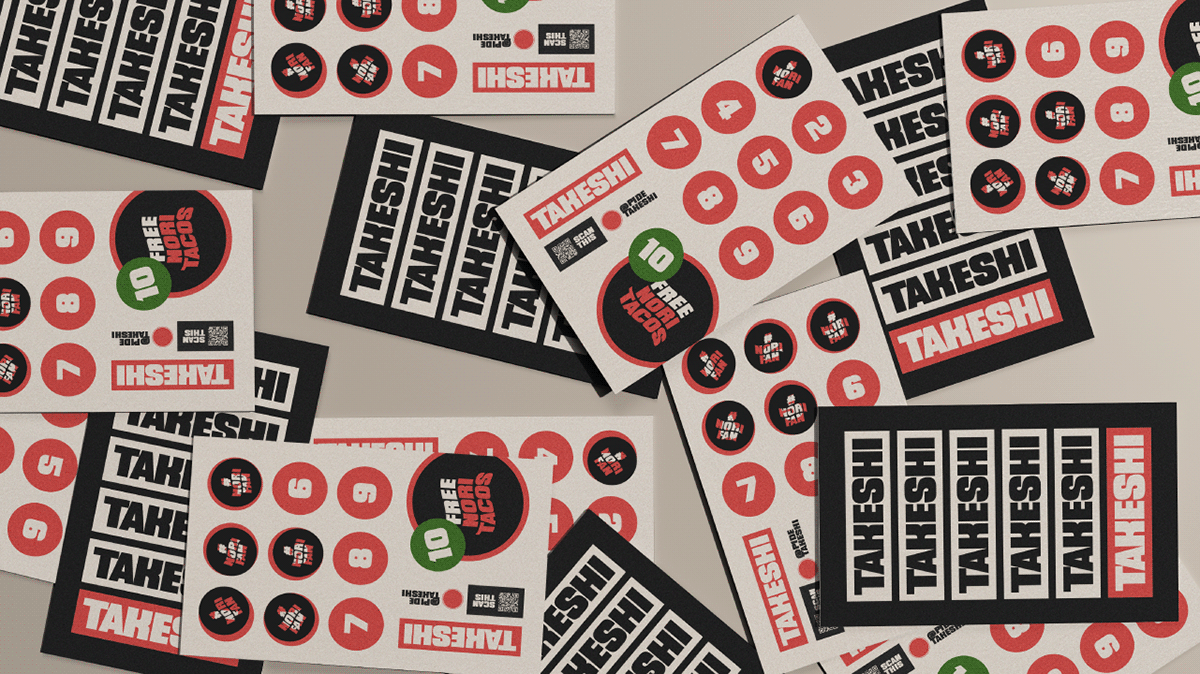


Takeshi’s identity uniquely combines illustrations and typographies with
the colors that usually represent the world of asian cuisine, with a fun twist.


